Here are 3 that are on my radar, and my analysis:
Nebraska:
The B1G conference newest addition has one of coolest uniforms that I have seen in a while. I really like the huge "N" in the middle of the uniform and the number on the shoulder blade where the Captians "C" normally is. This is a departure from most jerseys that you normally see.
Update: Apparently this is a 1-off jersey for the home opener, but I think they should keep it all season. It's pretty cool.
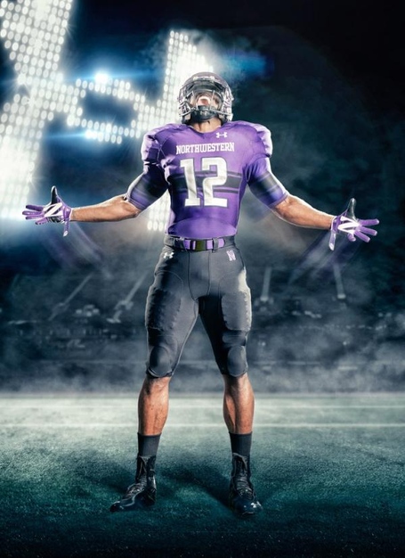
Northwestern:
I'm not going to say that not being able to find a video on the uniforms is major bummer, but come'on Under Armour, get it together. NU did a good job with the uniforms in keeping them in line with the NU tradition and colors. The stripe across the middle is a thowback to way back (circa 1950's) but still looks legit with the purple.
Texas A&M:
I'm a homer, I won't lie, but I'm still undecided about the new Aggie look for 2012. There is certainly a wow factor in these uniforms and aren't outlandishly a compete change. I do have two knocks though, I'm not a friend of the compression sleeves being that long on the arm and having logos that are representative of the university. It doesn't make sense to the look. I am also over the logo being put together while the hands were put together. It's been done, move on.
No comments:
Post a Comment